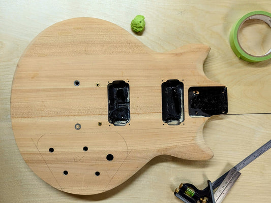
So, we have our blank slate. Beautiful, bare-naked, and begging for a change. Raw wood, species: unknown and unimportant (feel free to disagree with me on that point, it’s my project).
What we need now is a shape.
I’ve had some fun hotrodding existing guitars in the last few years. Sticking mostly with the strat format because measurements are standardized and parts are abundant. But I haven’t customized a body in a very long time.
That’s been the dream for Icarus.
| Note: Why “Project Icarus”? The name doesn’t seem to make much sense. Am I a huge Zeppelin nerd? Not really. Do I think my ambitions for this build are so far out of reach that my wings will melt and I’ll come crashing down to Earth? No. (Well, at least, not openly. I’m perfectly capable of all the steps involved here, but my hidden self-doubt is legendary…)
No, in fact, it’s way dumber than that. I needed a place to store some files about the project, and when creating a folder for said files I was thinking about Lazarus. You know, resurrection and whatnot. But my brain chucked out Icarus instead. I didn’t notice for a few weeks, and here we are. I like Icarus. So there. |
Shapes… Decisions, decisions.
This part of the design phase has a tendency to either be entirely overlooked, or given so much attention as to introduce crippling stagnation. Guess which one I picked?
I was never in danger of overlooking the body shape, having no interest in putting so much work into an instrument just to have it look exactly like a strat, tele, Les Paul, Fender offset, etc. But I so deeply desire the impossibilities of perfection that I want to approach certainty in my design decisions well before reaching the point of no return.
The steps used in this process have become too much of a crutch for my psyche, but they are nonetheless valid in smaller doses.
The first of these steps is digital.

When creating something new, pieces will go through several CAD iterations before being brought to life. In this instance, with an existing body in need of augmentation, digital photos were taken, and sketches made on top of those photos for a (theoretically) quick turnaround.
The idea is to bang out a number of rough concepts to help point you in the right direction. And it works. It really does, but it reaches the point of diminishing returns pretty quickly. If at all possible, real-world visualization is far more helpful.
Some people sketch, or make cardboard mockups. I like tape.

Light adhesive makes for quick iterations. Bold contrast helps to bring out the feel of what the finished shape might actually be like. Especially at a distance.
This is something my mother taught me many years ago. We would walk into an empty space, and start laying painter's tape on the subfloor to figure out the framing. Or layout cabinetry and appliances in a kitchen we were working on.
This walkway is a little too narrow.
I thought we could put the stove here and the fridge there, but it looks like the doors will interfere with each other.
You know, we actually have the space to bump this island out a couple more feet, which would give us more counter space over there.
What do you think?
Layout a rough draft. Step back. Make adjustments. Step back again. Repeat until satisfied. Work off of those measurements.
Incredibly helpful. IF you can actually just make a decision and run with it.
So I started taping up the body. Found something I might like. I’m not sure, so I prop it up in a way that’s somewhat believable. This allows me to look at it from around the shop. I’m still not sure, so it stays there for a couple of days. Gets some adjustments.

Sits for a couple of days.

Gets some adjustments.

And so on.
…This is the opposite of what I was taught.
This is NOT the rapid prototyping revolution made possible by modern technology. This is NOT a quick layout to get a feel for something and make a fast decision.
This is a hand-wringing delay tactic that gives me more time to obsessively seek a perfect design choice and completely ignore my own knowledge and advice that perfection is an illusion. This is shining a spotlight into all the reachable crevices of the void, searching for that illusion.
The trouble with this search: eventually you run out of crevices without finding that perfection. At which point you either start the search over again (confident that perfection is there, you simply need to look harder), give up entirely (and let the project’s clock run out), or accept that there is no perfection and move on with one of the shapes you happen to like.
This struggle in the pursuit of perfection is the largest hurdle in my making life.
Perfectionism leads to hesitancy. Hesitancy leads to stagnation.
But where does all of this really come from?
Fear.
The search for perfection is the search for an unassailable choice. Something that no one can question, that no one is capable of disliking or disagreeing with. In other words: the search for perfection is identical to the fear of judgment. The fear that others will refuse to accept these decisions, these actions, these structures, as valid.
The fear of rejection.
Perfectionism is, for me, simply the fear of rejection. From others, yes, but also from myself. The fear that someone will look at this thing into which I have poured my heart, sweat, and soul, and say I should never have bothered. Even if that someone is me.
Especially if that someone is me.
This is the real reason for documenting this project, and hopefully others, in this way. To beat back the mantle of perfectionism and present some work to the world. To simply make something I care about, and explain my philosophy and techniques.
Because in any creative act, there is no such thing as perfect.
In fact, in finding solutions to creative problems, even something as simple as a “right answer” is a myth. The possibilities in front of you are literally infinite. All you have is the choices you’ve made, and the reasoning that made sense to you at the time.
The ONLY certainty is this: Someone will not like it. And on the internet, at least one of them WILL let you know about it.
For recovering perfectionists, this should be good news (and I will attempt to see it that way). With this one available certainty in mind, we may be able to realize that the inner drive to avoid rejection is entirely pointless. Especially in trying to avoid that particular rejection that scoffs at your merest hope for acceptance.
It does not matter how perfect your results, someone will hate them. Someone will probably hate you for even considering them, or even just for existing and hoping others might like what you made.
For some, that may sound demoralizing, but I think it should be freeing. If I can come to truly accept all this, it will take most of the pressure off of any sort of creative endeavor. Certainly the pressure that kept me from writing this article for so many weeks.
So, ya know, Fuck ‘em.
It’s time to decide on a shape.
There are some design restrictions here (in addition to the original shape itself). A lot of them, actually. I'm keeping all of the functional pieces of the guitar body except for the strap button mounting points. That means whatever shape I come up with has to work around the existing neck pocket, humbucker routes, and control cavity.

This is, in fact, a good thing. Limitations help to strip away the terror of infinity. That might seem counterintuitive at first. Freedom to create is a necessary component of artistic expression, therefore less freedom would be bad. But the fear of the blank canvas is real. With a blank canvas, literally anything is possible. When that canvas includes factors that must be worked with, kept in place, or painted around your options as a creator have been narrowed down for you. Truthfully, those options are still infinite, but they are significantly less infinite than they would be otherwise.
These design limitations automatically move you further down the path. Forced necessities in a project also help to produce more creative solutions in the end. So again: restrictions are often for the best.
In search of more unique body styles, I’ve been hoping to blend the geometric with the organic. At least, in the long term.
Like so many other things, I thought it would be… easy? Or maybe simple? They always seem so close together, but simple and easy are usually deceptively far apart.
Straight lines connected by soft, supple curves. It seemed like a pretty straightforward idea, but those are just words, and words won’t do where shapes are concerned. Anyway, perfection is an illusion and design philosophies do not emerge fully formed at the end of a single project.

We ended up much more geometric than organic (whatever the word “organic” actually even means). I like this shape very much. It does feel a bit derivative of some other modern guitars from makers I admire, but that’s to be expected. I certainly didn't start with a blank canvas, and I have nearly zero experience in guitar design.
Sure, I could obsess over it some more.
But, at a certain point, you just have to cut into it.


